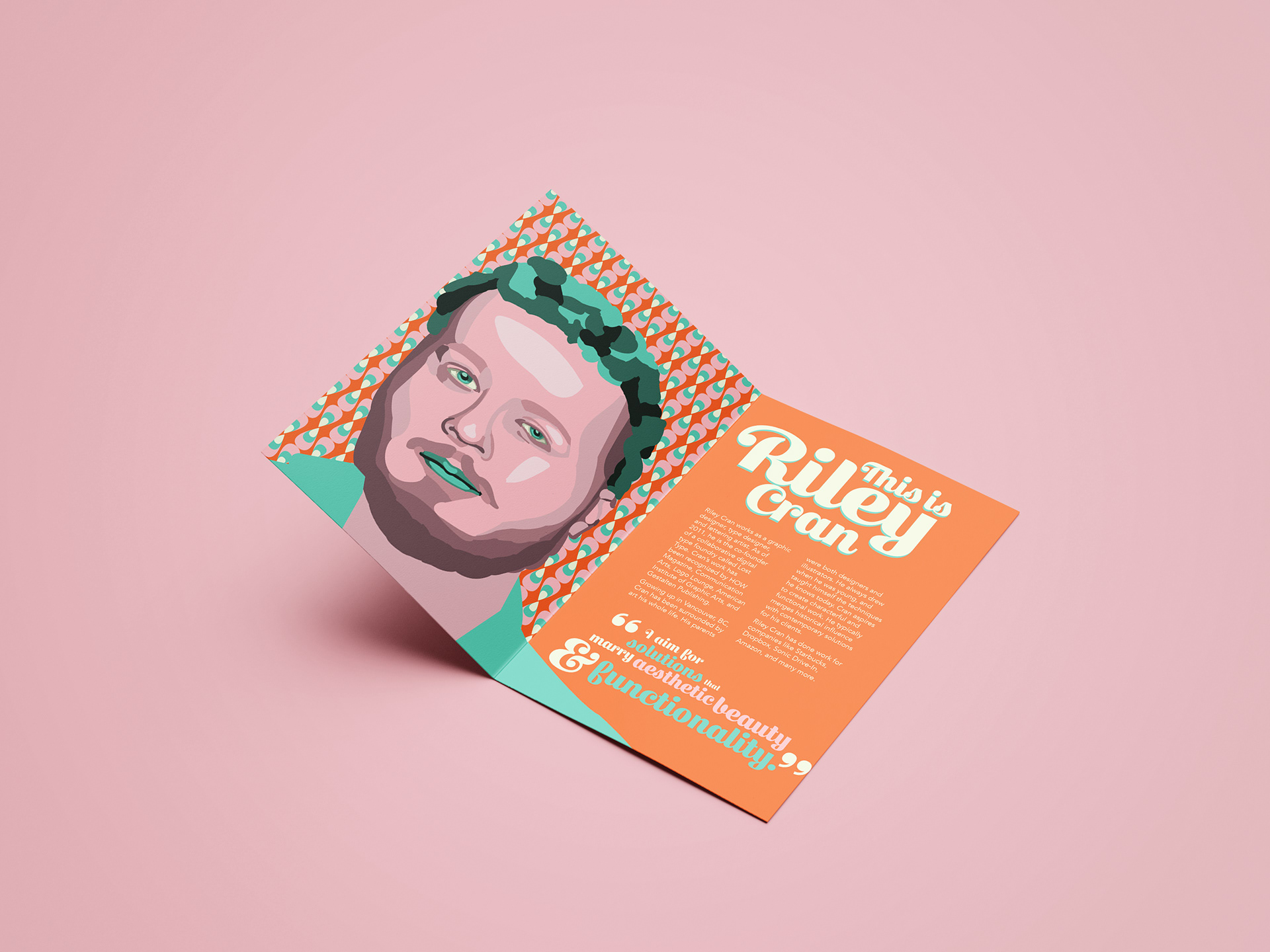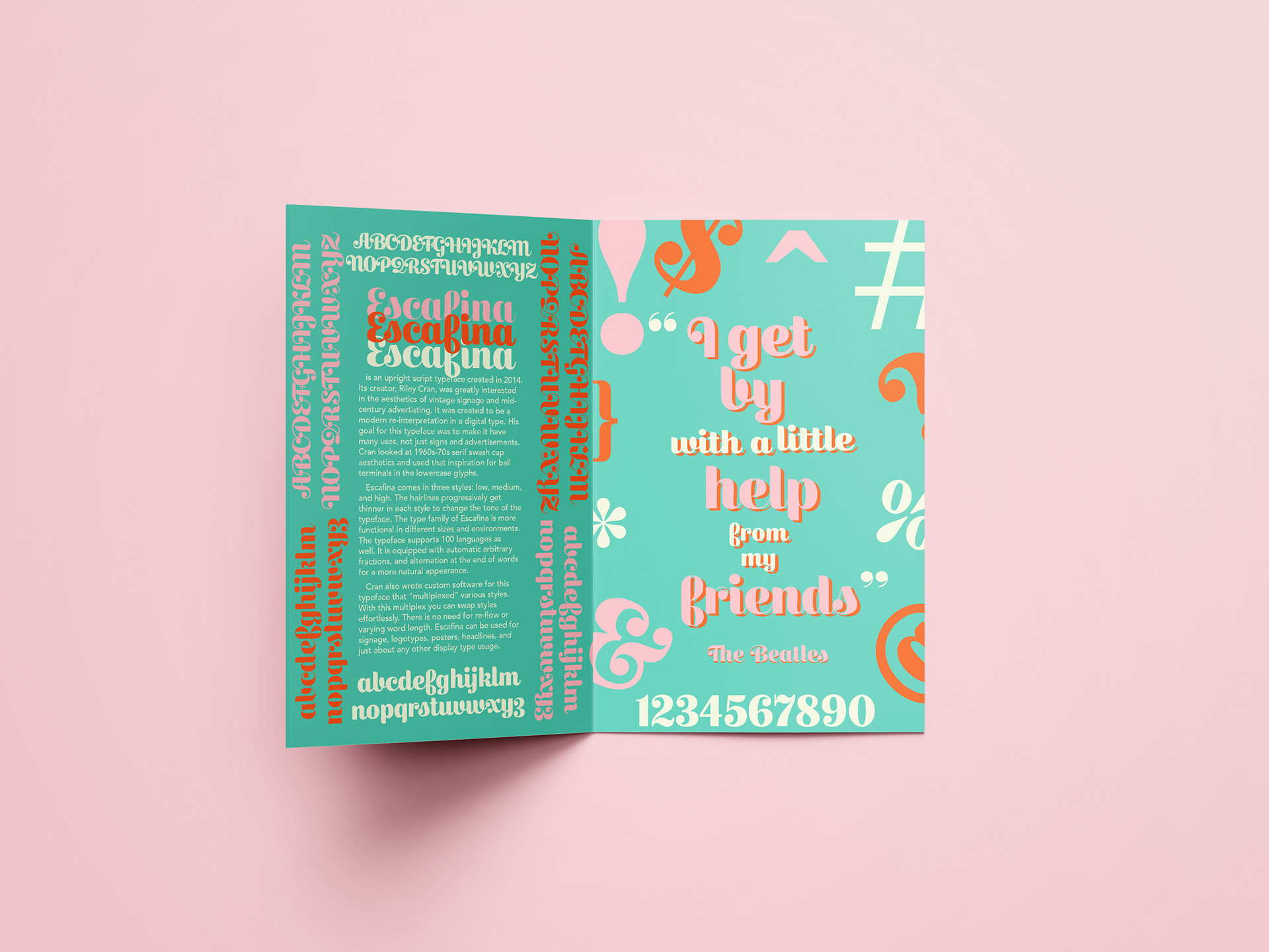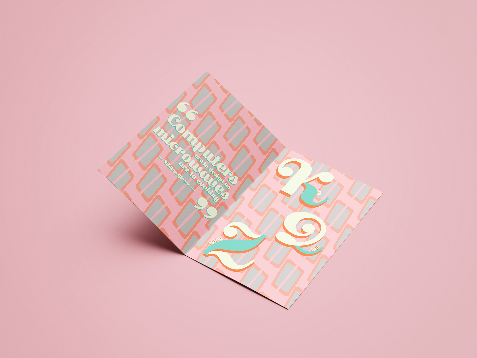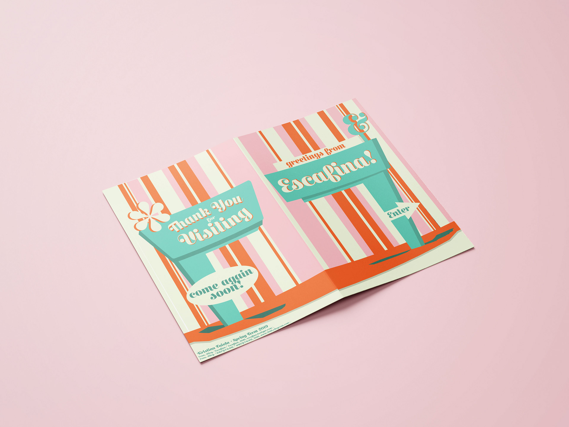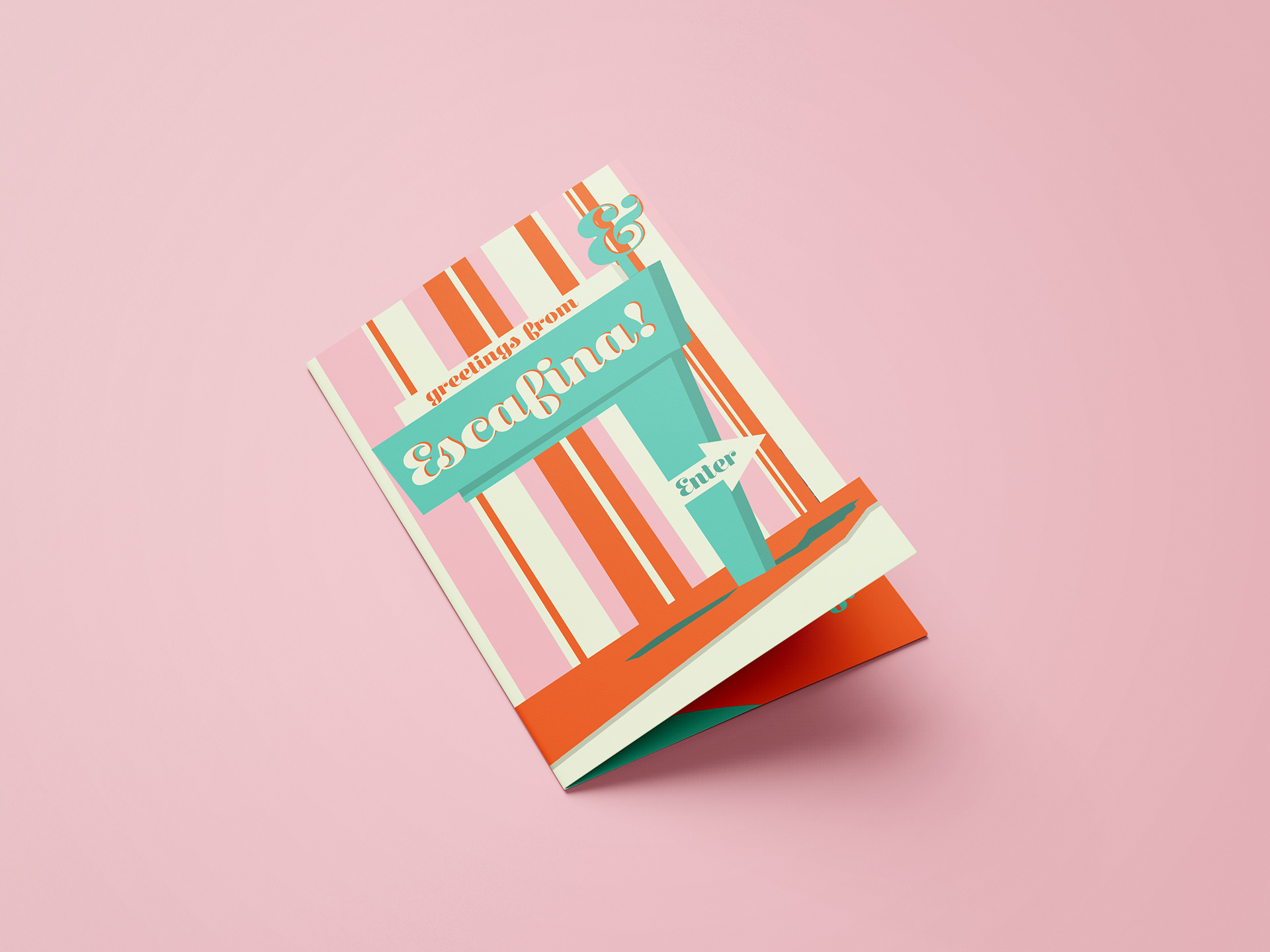
A retro and fun take on Escafina, a bold script display typeface created by designer Riley Cran. The objective in this design was to outline the history, anatomy, and functionality of the typeface in an eight page booklet. Escafina consists of three different weights, high, medium, and low contrast. The font itself is inspired by vintage signage and mid-century advertising, which is why I was highly inspired by old school motel signs and retro color combinations. All patterns were inspired by popular vintage styles of their time. A challenge faced during this process was using body copy in the design. The book was supposed to have only used the typeface it was about, but since Escafina is a display typeface, the body copy would have been illegible. To combat this setback I paired the typeface with a sans serif type for it to be readable.
