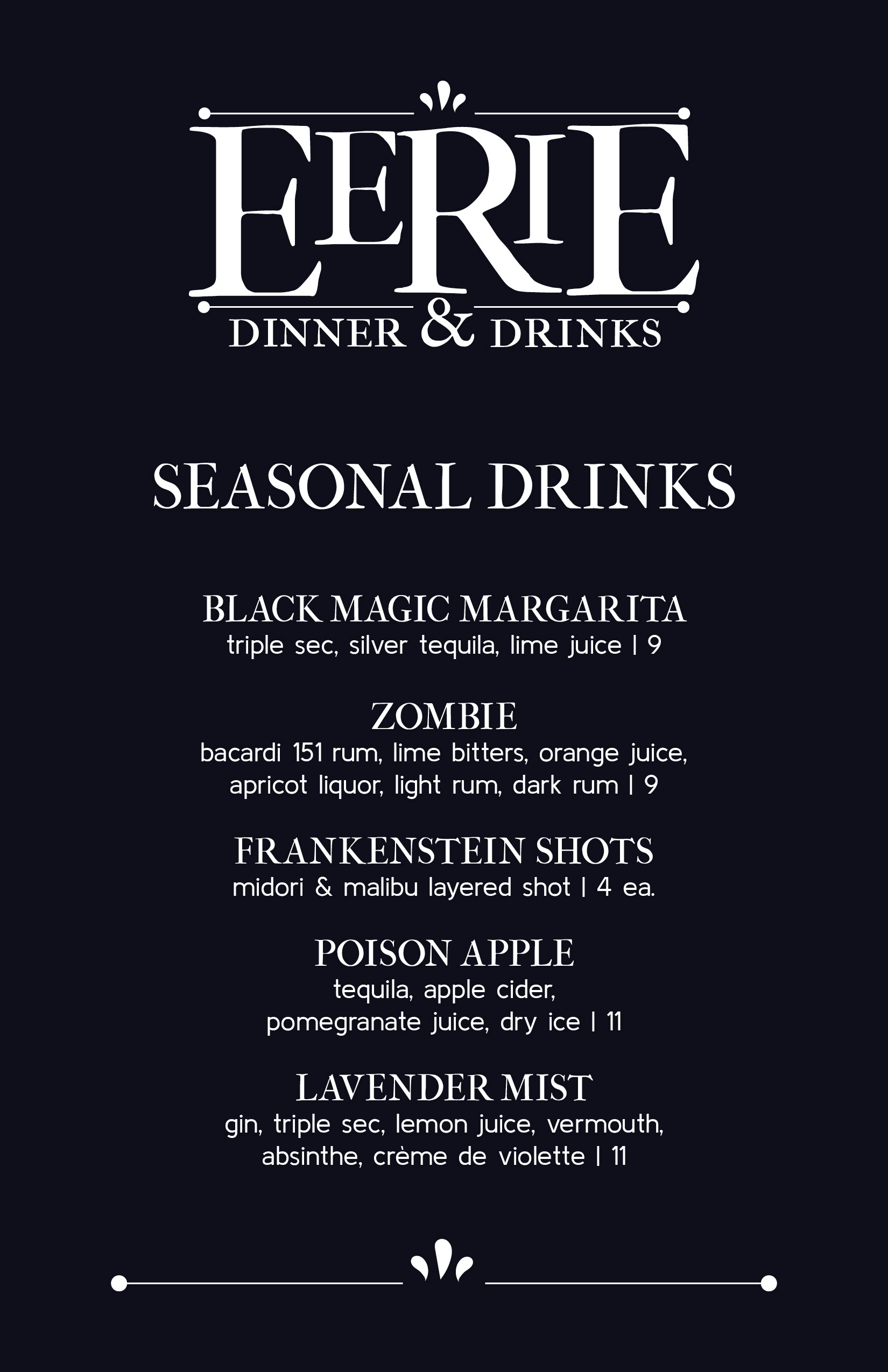
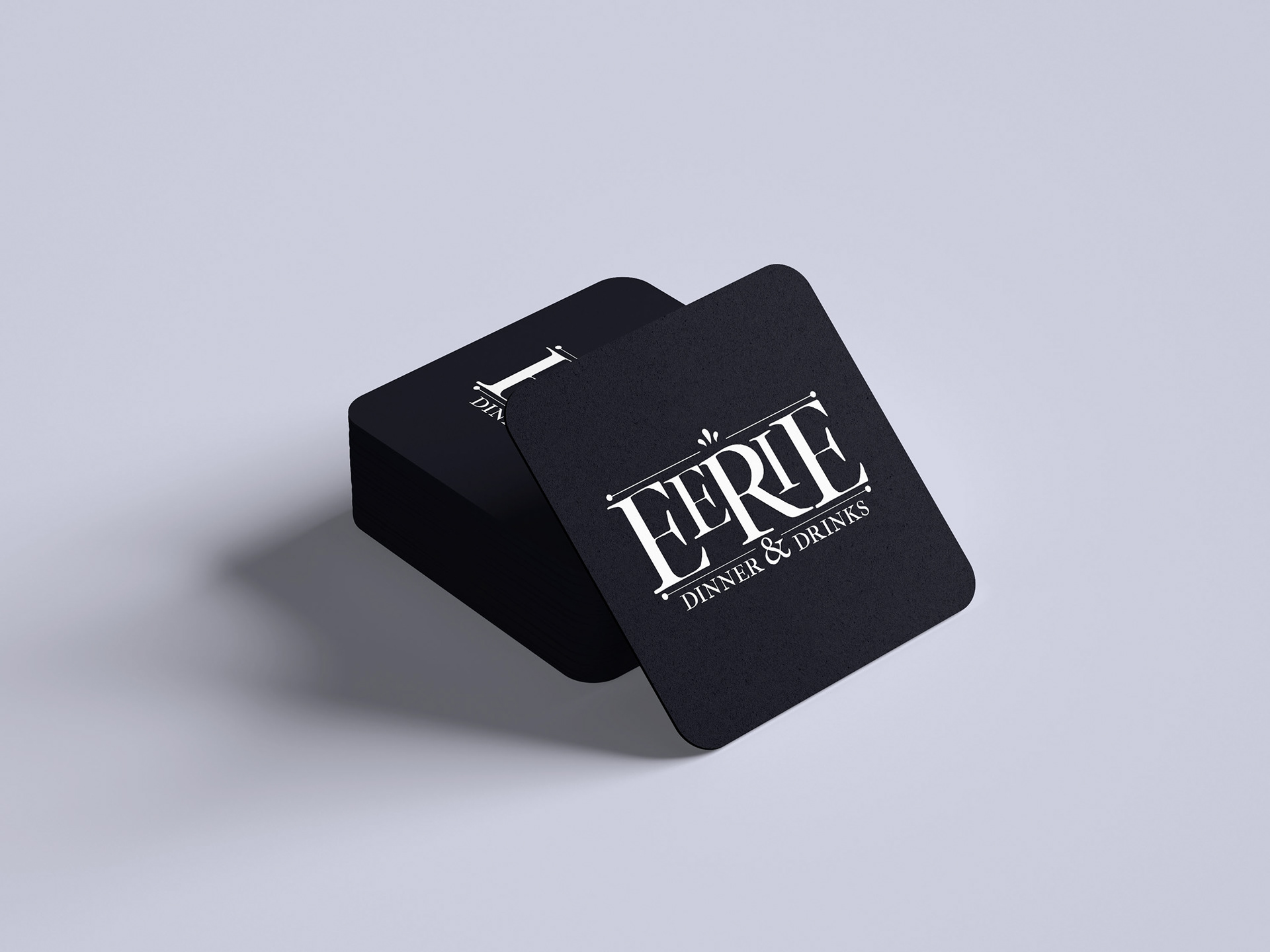
Eerie was a logo concept expanded from a branding trends project in which I created 10 different logos from the same word. I chose the historic style logo that I designed to expand upon. In an effort to make this brand come to life, I created a small seasonal drinks menu for the Halloween season to play into the brands’ “eerie” title. It is meant to be a small, handheld menu that you would receive with a regular dinner menu. Along with the menu, I designed coasters with the brands logo on them, and mocked up the logo on what could be considered the restaurant window. The logo is also responsive for different forms of media. With this responsive logo set, it can be used in different sizes for different purposes, like social media.
